Data analytics has revolutionised the way businesses operate in today’s fast-paced world. With the availability of vast amounts of data, analysis and interpretation have become crucial for decision-making processes.
Dashboards and reports are two essential tools used in data analytics to help organisations visualise complex information easily. While both serve similar purposes, they differ significantly in terms of their functionality, features, and benefits.
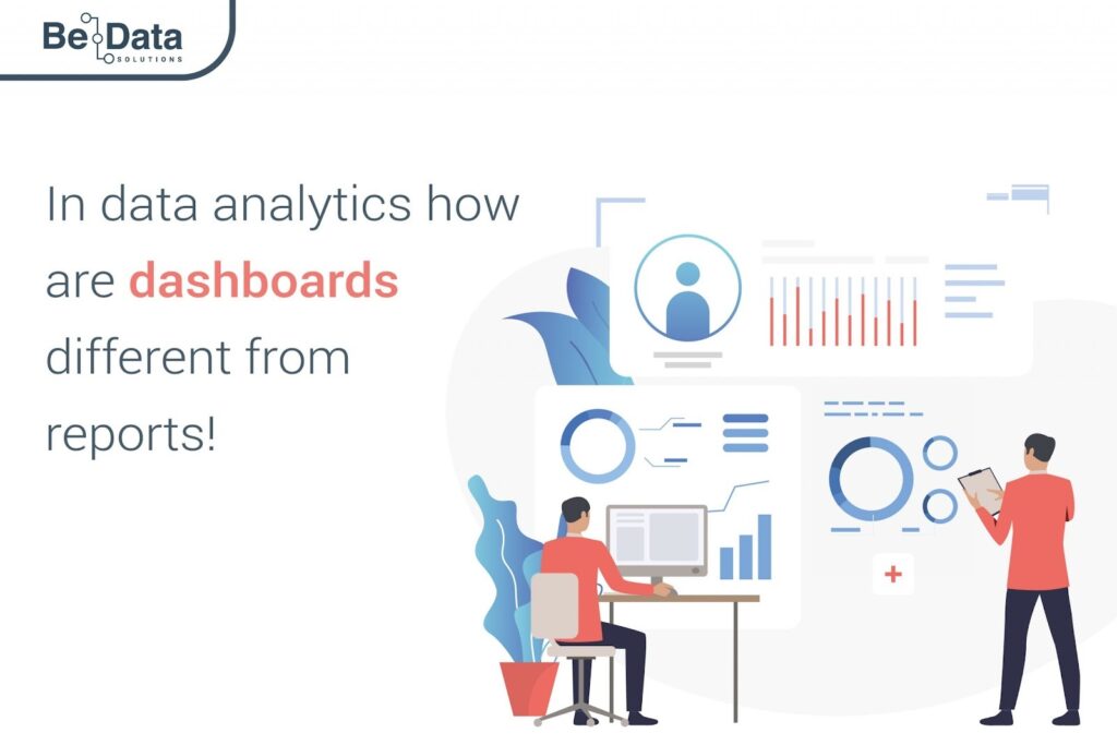
In this article, we will explore the key differences between dashboards and reports in data analytics and discuss how each tool can enhance your business insights effectively!
Understanding the Key Differences: Dashboards vs. Reports
Dashboards and reports are two essential tools used to analyse data. Dashboards provide users with an overview of the data in real-time, while reports offer detailed insights into specific aspects of the data.
Dashboards typically display key performance indicators (KPIs) in a visual format that can be easily understood by stakeholders. They use charts, graphs, tables, and other visualisation techniques to present information concisely.
Reports, on the other hand, tend to be more text-heavy and contain detailed explanations of the data analysed.
Another significant difference between dashboards and reports lies in their level of interactivity. Dashboards allow users to interact with the displayed data directly by customising views or drilling down into specific details. Reports tend to be static documents that cannot be customised as much.
Benefits of Dashboards in Data Analytics
The primary benefit of dashboards is the ability to present complex data sets in a visually appealing manner that facilitates quick comprehension.
One significant advantage of using dashboards is their speed and agility in delivering real-time insights. Dashboards allow users to monitor key metrics continuously, enabling them to make informed decisions quickly. With interactive features like filters and drill-down capabilities, users can easily explore patterns and trends within their data.
Another benefit of using dashboards is the ease with which they enable collaboration between teams. By sharing a dashboard with multiple stakeholders, team members can work together towards common goals while viewing the same information simultaneously.
Moreover, dashboards provide customization options that cater to different user requirements based on roles or departments. With customizable widgets and personalised views, users can tailor their dashboard experience for maximum impact.
Exploring the Advantages of Reports in Data Analysis
Reports play a significant role in data analysis by providing an organised and comprehensive overview of the insights gained from complex datasets. One of the most significant advantages of reports is their ability to provide in-depth analysis, often with more detail than dashboards offer.
Reports are customizable, allowing for tailored insights that can help businesses make informed decisions. They allow for slicing and dicing data in various ways, including filtering, sorting, and grouping. This customization helps users gain an understanding of what has happened within their business over time.
Another advantage of reports is that they offer a more detailed view than dashboards when it comes to historical trends or patterns. Reports also facilitate better collaboration between teams as they can be shared across departments.
Designing Effective Dashboards for Data Visualization
Dashboards serve as an essential tool in data analytics, providing real-time insights into critical business metrics. However, designing a dashboard that effectively communicates complex data is no easy feat.
Here are some tips to help you create effective dashboards for your organisation:
Firstly, it’s important to consider the audience who will be using the dashboard. Understanding their needs and preferences can help guide design decisions and ensure the final product meets their expectations.
Secondly, keep in mind that less is often more when it comes to visualisations. Avoid cluttering the dashboard with too many charts or graphs; instead, focus on displaying key performance indicators (KPIs) that provide actionable insights.
Thirdly, colour coding can enhance readability and make information easier to digest quickly. Use contrasting colours sparingly and strategically to draw attention where needed.
How Dashboards Enhance Real-Time Data Monitoring
Dashboards are an excellent tool for real-time data monitoring. They provide a quick and easy way to visualise key metrics and trends, enabling users to make informed decisions based on up-to-date information.
With dashboards, you can monitor multiple data sources in one place, giving you a comprehensive overview of your business operations.
One of the main benefits of using dashboards for real-time data monitoring is that they allow you to identify anomalies and outliers quickly. By setting up alerts and notifications within your dashboard, you can be immediately alerted when something unusual occurs in your data, allowing you to take action promptly.
Another advantage of using dashboards for real-time monitoring is that they enable collaboration among team members. Dashboards are often shared throughout an organisation so everyone has access to the same information at all times.
This helps facilitate communication between teams and enables them to work together more efficiently towards common goals.
With customizable features such as interactive visualisations and filters, users can easily drill down into specific areas of interest within their datasets quickly without having any technical expertise.
Leveraging Reports for In-Depth Data Analysis
Reports play a crucial role in data analysis. They are designed to provide comprehensive insights into the performance of specific areas or processes within an organisation.
Reports offer in-depth and detailed information on various metrics, including trends, patterns, and anomalies that can be used to make informed decisions.
One of the biggest advantages of reports is their ability to present complex data sets in a structured format that is easy to understand and analyse.
They allow users to drill down into specific details and obtain granular insights that may not be immediately apparent from visualisations presented on dashboards.
Reports also enable users to compare different datasets over time or across different segments and visualise them side by side for effective comparative analysis.
This feature helps analysts identify emerging trends, predict future outcomes with greater accuracy, and develop actionable recommendations based on these findings.
Customization Options in Dashboards for Tailored Insights
One major advantage of dashboards over reports is the level of customization options available. With dashboards, users can tailor their insights to fit their specific needs and preferences.
Customization options include choosing which metrics to display, selecting chart types, adjusting data ranges, and even customising colours and fonts. These features allow users to create a personalised dashboard that highlights the most important information at a glance.
Another benefit of customization is the ability to filter data by certain parameters such as date range or product type. This allows users to drill down into specific subsets of data for more targeted insights.
Interactive Features in Dashboards for Enhanced User Experience
Interactive features in dashboards are essential for enhancing user experience. These features allow users to delve deeper into the data, interact with it and gain insights that may have otherwise gone unnoticed.
One common interactive feature is the ability to filter data. Users can select specific criteria, such as time frames or categories, to hone in on particular metrics that are relevant to them. This allows them to see trends over specific periods of time and make more informed decisions based on those insights.
Another valuable interactive feature is drill-down functionality. By clicking on a particular point in a chart or graph, users can access more detailed information about that specific metric. This capability enables them to identify patterns and correlations between different variables within the data.
Conclusion
Both dashboards and reports play a crucial role in helping businesses make decisions.. While dashboards provide real-time monitoring capabilities with interactive features for enhanced user experience, reports offer more detailed insights into complex data sets.
When it comes to choosing between the two, organisations should consider their specific needs and goals.
Effective data analysis requires leveraging both dashboards and reports to gain a comprehensive understanding of business operations.
By utilising the benefits of each tool, organisations can make informed decisions based on accurate and up-to-date information.